

ChristyHC
Member
First, you need a short back story. My family is into sport stacking and is going to be hosting a tournament in MI in June. If you don't know what sport stacking is it is stacking 12 cups into pyramids in patterns as fast as you can. You can see my son at a tournament here.
Second back story you need to know is that if you ask someone from Michigan where they are from they will often use their hand to model the shape of Michigan and then point to the spot where their city is.
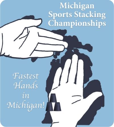
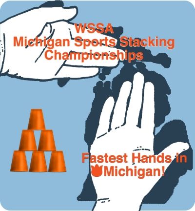
So for our tournament we need a logo. I totally stink at this kind of thing, but since I have photoshop skills they asked me to come up with something using the slogan "The fastest hands in Michigan" with the idea of "hands" being in the shape of MI. I took a picture of my sons hands over a picture of Michigan and added some sketch effects. The tulip (the tournament is in Holland, MI) is to show where Holland is.
Here is a rough draft I'm working on:
Please give me some constructive criticism!!!
What color scheme should I use?
My dh wanted the words on the graphic, but how do I make them stand out. I've tried a light background (top words) and a dark shadow (bottom words). I've tried strokes too but didn't like the result.
Do I clean up the hands more? Do I try to make them stick out more?
Help - I need ideas to make this better.
Second back story you need to know is that if you ask someone from Michigan where they are from they will often use their hand to model the shape of Michigan and then point to the spot where their city is.
So for our tournament we need a logo. I totally stink at this kind of thing, but since I have photoshop skills they asked me to come up with something using the slogan "The fastest hands in Michigan" with the idea of "hands" being in the shape of MI. I took a picture of my sons hands over a picture of Michigan and added some sketch effects. The tulip (the tournament is in Holland, MI) is to show where Holland is.
Here is a rough draft I'm working on:
Please give me some constructive criticism!!!
What color scheme should I use?
My dh wanted the words on the graphic, but how do I make them stand out. I've tried a light background (top words) and a dark shadow (bottom words). I've tried strokes too but didn't like the result.
Do I clean up the hands more? Do I try to make them stick out more?
Help - I need ideas to make this better.