Black and white photos - convince me!

Sherri Tierney

New member
I often see a fabulous kit but don't pick it up because the colors won't match any of my pictures. In the back of my mind there's always that little voice saying that I *could* make my photos black and white but I have a real problem with black and white these days. I LOVE it for photos hanging on my wall but I don't like it for my layouts. I don't know why either. I guess I feel like I'm losing something by converting my photos.

Convince me its okay... :)
 
oohh.. i LOOOVE B&W. I scrapped today using the petit 4 a perfect gentelman and to me it screamed "use with b&w photos" i think it can really make a layout shine when you convert to b&w
 
Hmmm... I'd say if you love color photos, try playing with some actions. Because you can really change the look of a color photo with them. If it's not a perfect match and I really want to keep it color, I always try a few actions on the photos before I "give up" and choose B&W. :)
 
Also... I've changed the color of people's clothes in Photoshop to match a kit before. :)
 
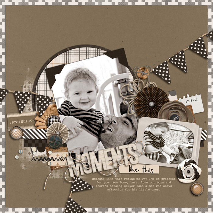
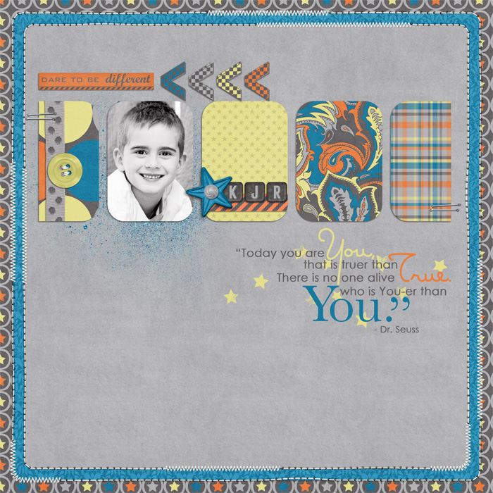
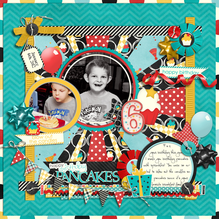
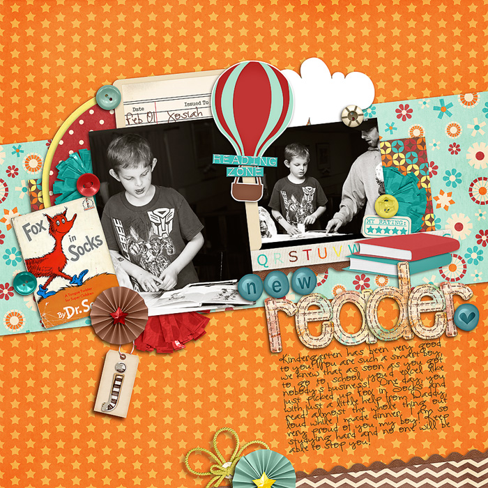
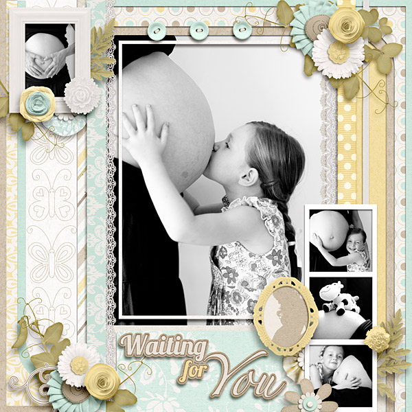
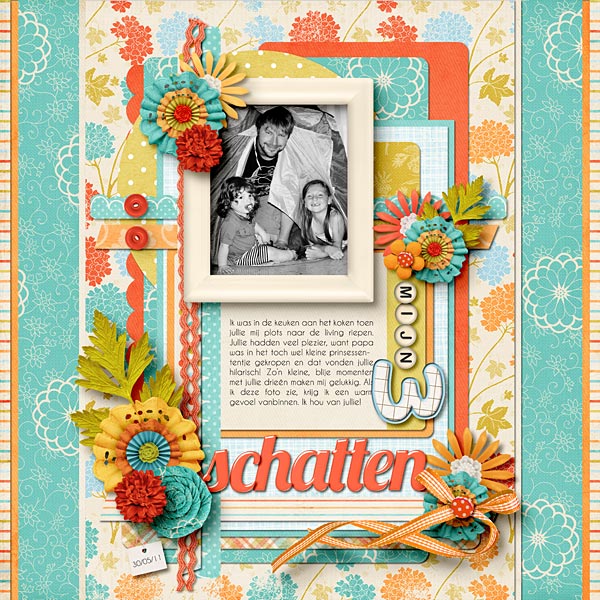
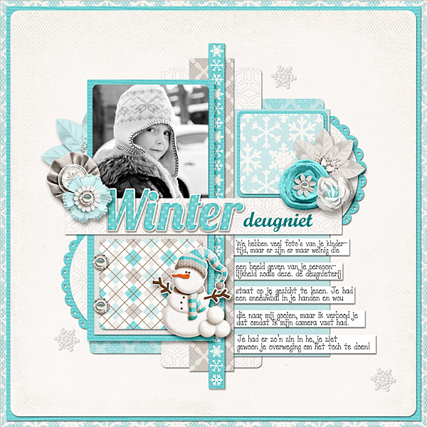
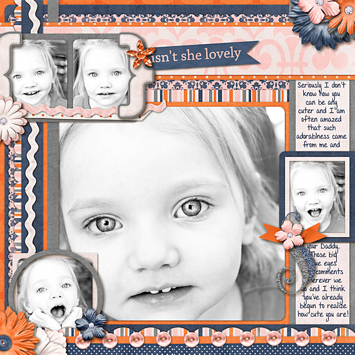
I use B&W about 25% of the time...

momentslikethis1.jpg


yourethanyou.jpg


birthday-pancakes.jpg


newreader.jpg


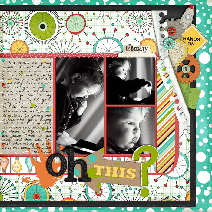
ohthis.jpg


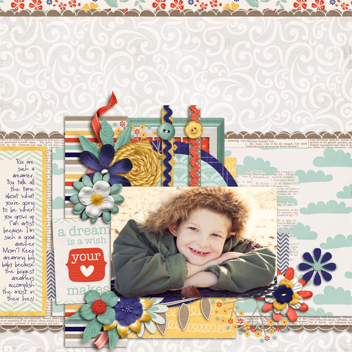
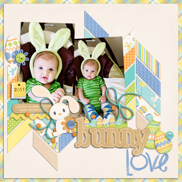
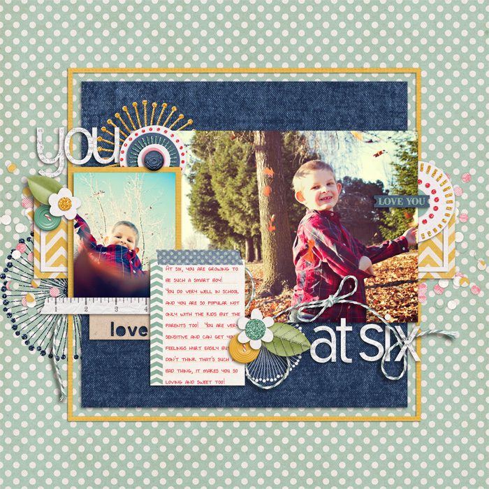
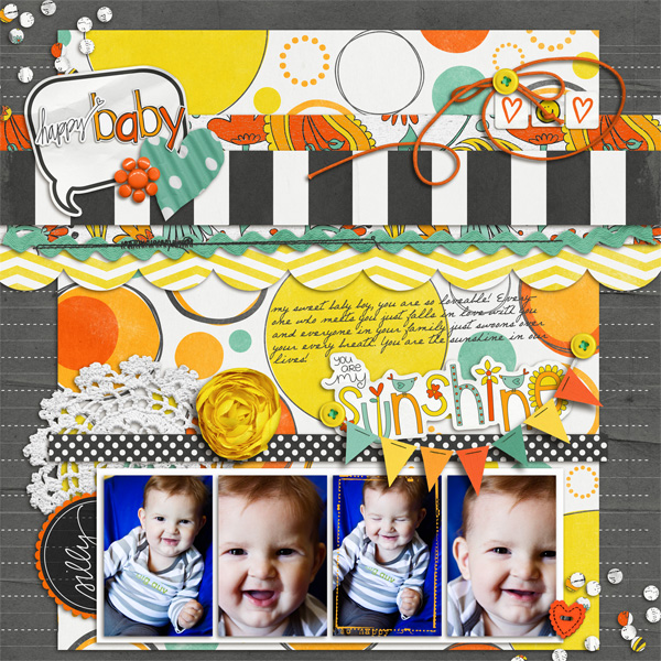
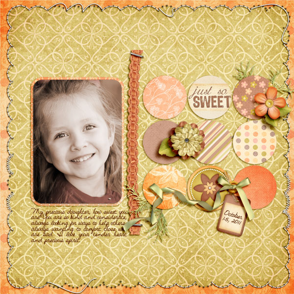
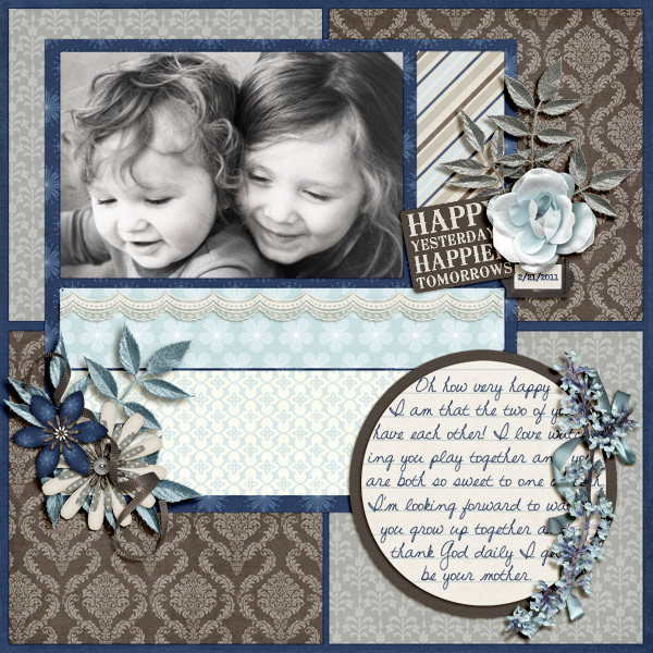
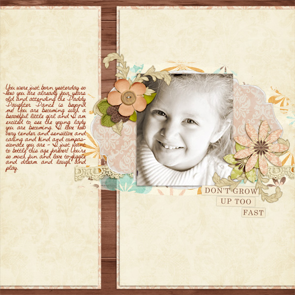
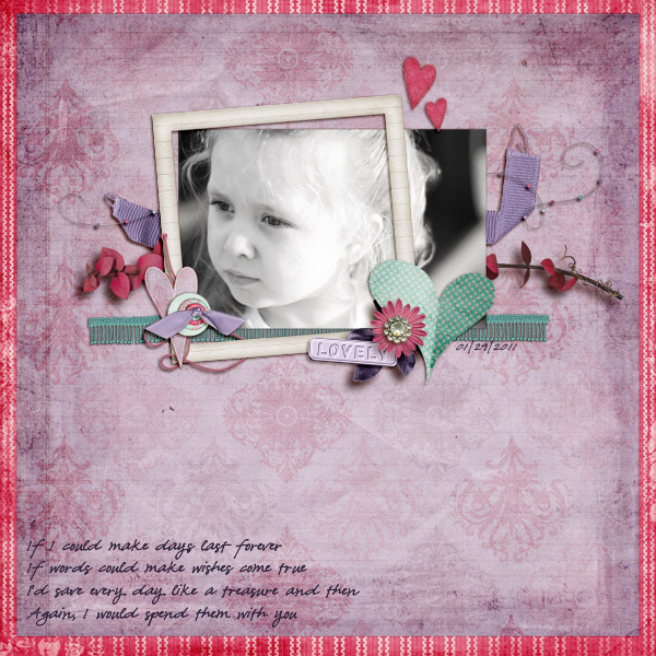
But also...a kit doesn't HAVE to match your photos color wise...some examples :)

dreambig2.jpg


bunnylove.jpg


youatsix.jpg


happy-baby1.jpg
 
Love that page, Kristin!

Great examples, Traci!

You know, I love seeing other people's layouts with black and white pictures but I have a hard time using black and white on my own. I don't understand it either.

I do use actions to edit the photos, Brook, and I have changed clothes (somewhat) to match a kit. I know things don't really have to match but I don't want it to clash either, you know?
 
There have been times that I've scrapped a photo B&W because I really wanted to get it scrapped, then when a new release comes along that matches my photo better, I'll re-scrap it. For me, I like to get the memories preserved- I can always keep the color file saved, too, so I can always change my mind and re-scrap it later!
 
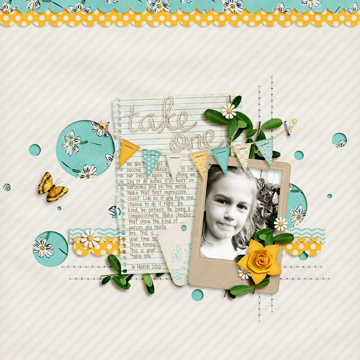
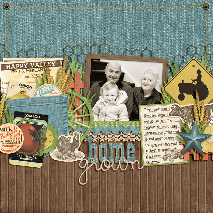
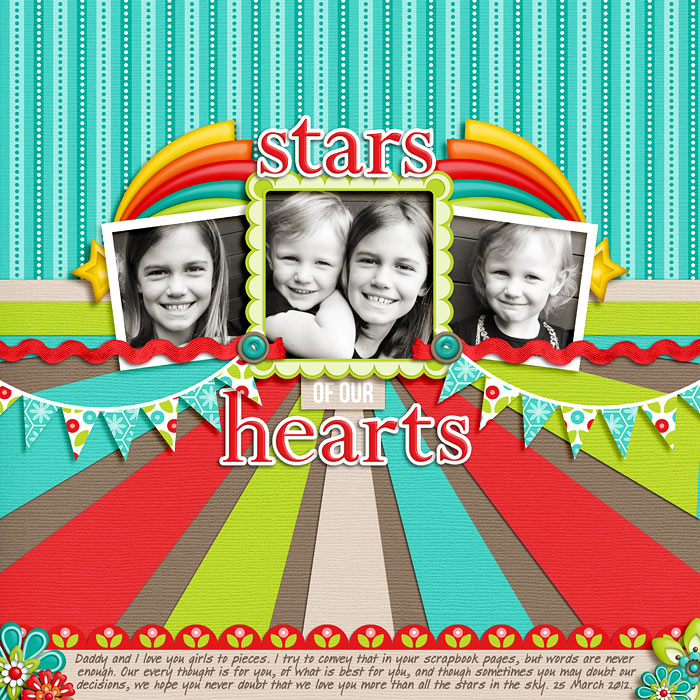
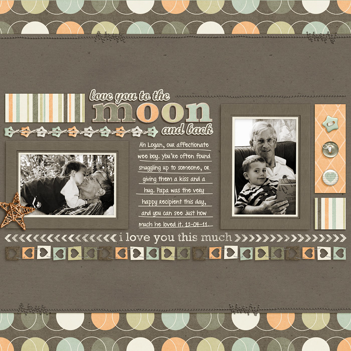
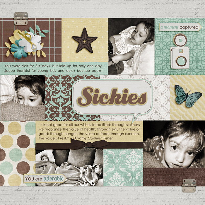
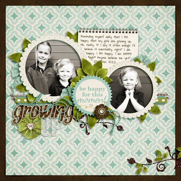
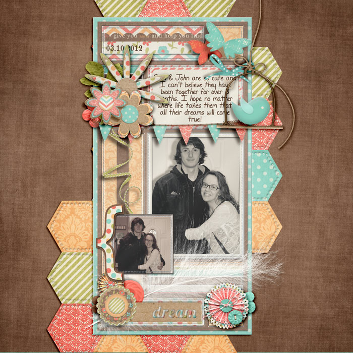
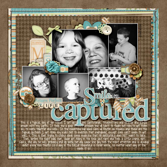
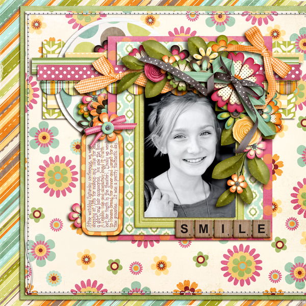
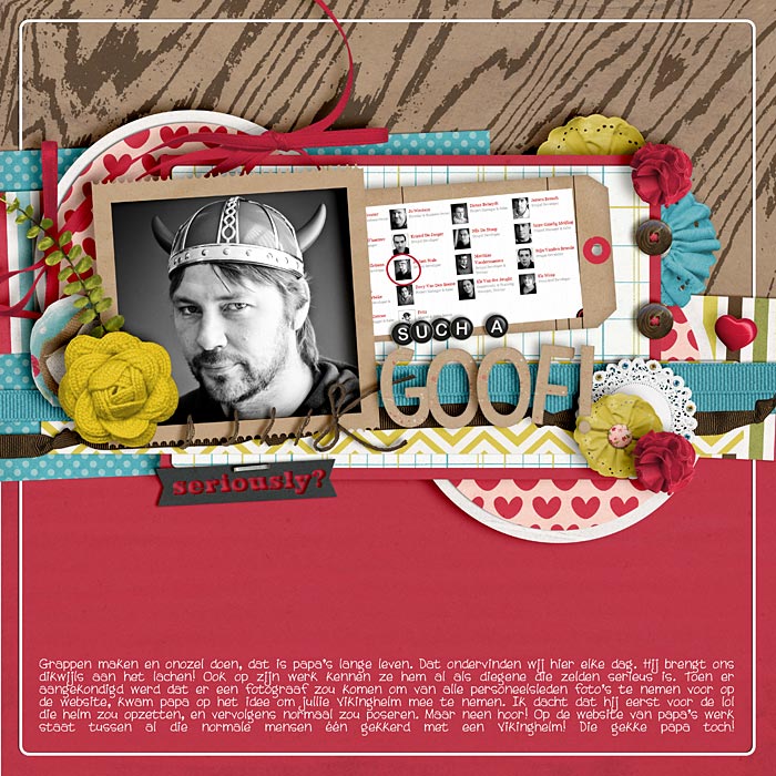
I don't often change photos to B&W, but I love the end result when I do. My favourite action is B's Vanilla B&W. Has a slight chocolate tone to it that allows you to adjust saturation to suit. All the following layouts use this action:

12-03-16-Take-One-web.jpg


11-05-02-Home-Grown-web.jpg


12-03-25-Stars-of-our-hearts-web.jpg


11-04-12-Love-you-to-the-moon-and-back-web.jpg


11-09-26-Sickies-web.jpg


11-11-25-Growing-Up-web.jpg
 
Last edited:
i like bw pictures because it seems to tone down everything else in the picture, kwim? and then it draws you into what you want...which for me is my children's face.

i've done what Traci's suggested numerous times too....the pictures don't have to match the kit (most of the time they do), especially if i'm really wanting to just scrap it & not wait for the perfect kit.
 
I convert when either the colors don't match, or I think the photo will be more striking in black & white.

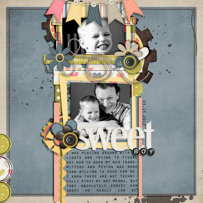
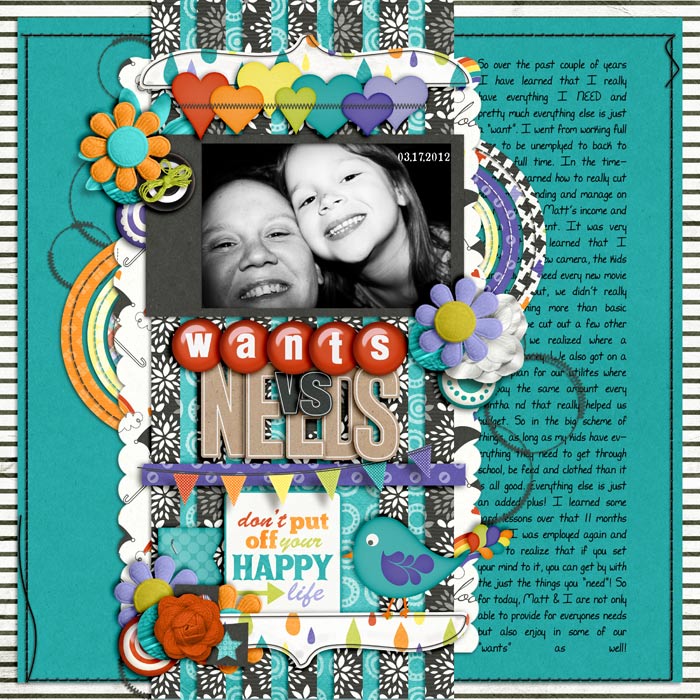
Examples:

momflowers4web.jpg


(this one is actually sepia)

KCB-sweetcaroline.jpg


brosis2-4web.jpg


treed-insd2011-template1.jpg


timeinabottle4web.jpg


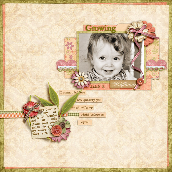
likeawildflower4web.jpg


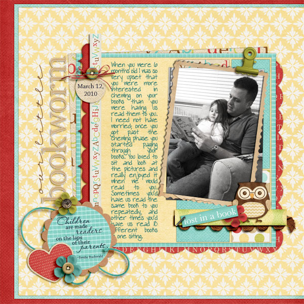
ourlittlebookworm4web.jpg
 
I'm more like you, Sherri. I love looking at other people's B&W photos, and I can identify some of my own photos that would be more striking or easier to scrap in B&W. But I still can't do it. I think color plays into my memories a lot. I'm terrible with names and not so great with faces--when I meet new people, I'm more likely to remember the colors they were wearing. Somehow I just don't feel as strong a connection with my photos or memories when they're B&W.

The one compromise I've seen on some LOs and liked recently is a mix of B&W and color photos. If I wanted to use a kit that clashed and muting the colors in the photos wasn't enough, I think i'd try converting the focal photo(s) and leaving a smaller photo in full color.
 
I love B&W or a sepia if the kit I want to use has brown in it :)

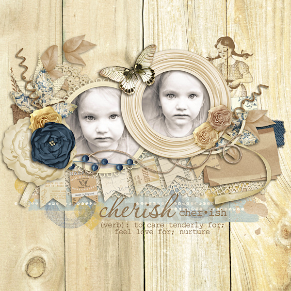
btw the name of this kit is Tomboy :)

in these pictures Abby's jacket was pink and black and the pictures weren't completely in focus so I made them smaller and B&W :)


none of these pictures would have looked right in color lol

 
I'm like you, I hesitate to convert my photos to black and white. I feel like a little bit of the memory is lost when the color is taken out of the photo. It makes sense to me if I'm trying to create a 'timeless' look to the page, but when I want to capture a specific moment, I just can't bring myself to convert to black and white.

I know, I'm no help.
 
I use b/w photos for other reasons:
my original photo is poorly exposed...usually some blown out bits, and processing in b/w makes it easier to recover some of the highlights and make it way less noticeable.

and this is probably just a weird quirk with me, but skin tone. I do desaturated vintage and b/w processing on a lot of photos where I'm in the pic with my husband and/or kids becaus they have yellow undertones and I have pink undertones. I typically like warming up the self-portraits I take, but it makes my family look orange and yellow. Conversely, using the cooler tones on them makes me look like a pre-school program's character.

I always keep the original photos...or at the very least a minimally processed one. I do what I want with them for my layouts knowing I can always go back to the originals any time I want.

I think Traci had some great examples of how the colors don't have to match the kit. I do see how SSD kits can typically compete for color tho.
 
I'm one that the colors in the photos must match the colors in the kit. If I want to use the kit and it doesn't match my photos, I'd rather turn them b/w than have them not match.

But, I try really hard to choose kits that match the photos (or do some re-coloring) because, like Rachel, colors play into my memories. :)
 
I'm like you, I hesitate to convert my photos to black and white. I feel like a little bit of the memory is lost when the color is taken out of the photo. It makes sense to me if I'm trying to create a 'timeless' look to the page, but when I want to capture a specific moment, I just can't bring myself to convert to black and white.

I know, I'm no help.

I think I rarely have just one photo from an occasion, so I often have a layout nearby that has original color in it for reference.
 
I'm more like you, Sherri. I love looking at other people's B&W photos, and I can identify some of my own photos that would be more striking or easier to scrap in B&W. But I still can't do it. I think color plays into my memories a lot. I'm terrible with names and not so great with faces--when I meet new people, I'm more likely to remember the colors they were wearing. Somehow I just don't feel as strong a connection with my photos or memories when they're B&W.

The one compromise I've seen on some LOs and liked recently is a mix of B&W and color photos. If I wanted to use a kit that clashed and muting the colors in the photos wasn't enough, I think i'd try converting the focal photo(s) and leaving a smaller photo in full color.

I think that this is a lot of it. Color plays so much in to the memory of the photos. That's probably why I can enjoy other people's black and white pictures so much and yet have such a hard time converting my own. I will play around with a picture and convert it to black and white and then start remembering how the light was making my daughter's hair shine or something like that and it seems to have so much more emotion in color (for me anyway). Hmm... I just looked back through some REALLY old layouts and realized that about 1/4 of them had black and white pictures. I don't know why I can't seem to do it now.
 
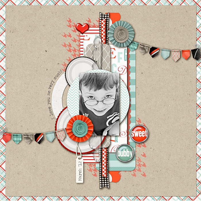
I think 95% of my layouts are with color photos. I don't even change the color of what my kids are wearing....I figure eventually a kit will come out that matches!! Here is one of the few....
 
I do both. I understand what you mean, about color playing part of the memory. I mostly prefer to use colored versions of my photos as well. but I still use b&w or tinted photos, to match my layouts. I think b&w works well when:
there aren't too many photos on your page
the photos are portraits
to add a little drama to a powerful photo that already speaks for itself (for whatever reason)

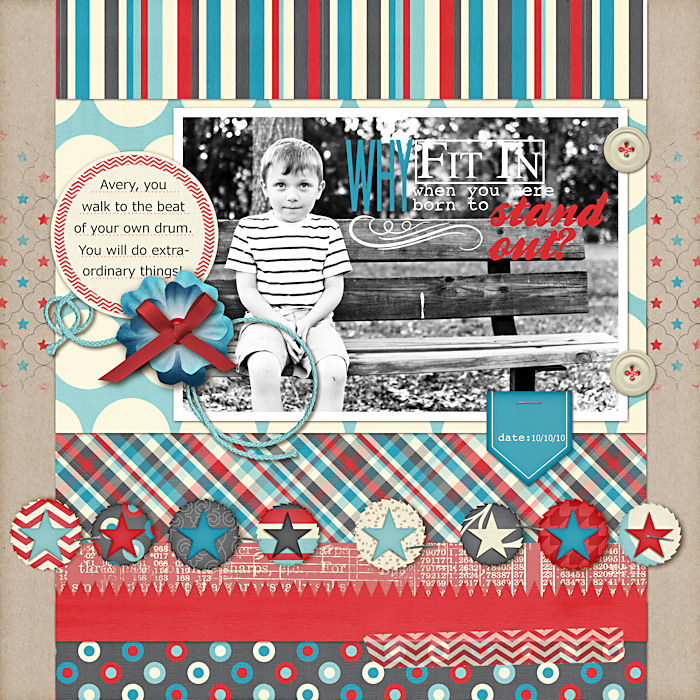
Here are a couple of mine:


I love to use b/w ...probably 1/3 of my layouts I convert to b/w pics lol


This pic of DS was so cute but it way underexposed but converting to b/w made it perfect :)


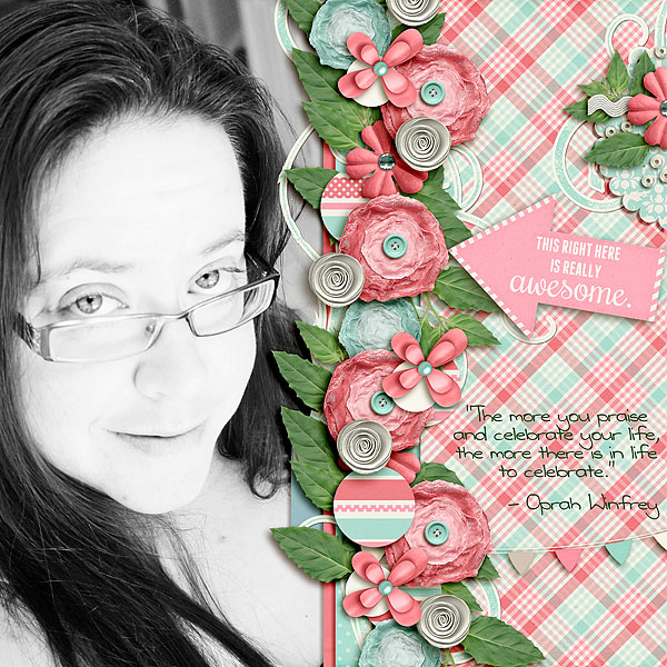
I LOVE b&w, especially with a high contrast!

I loved it for this pic because the pic was too washed out because I was in front of I window and the glare in half my glasses was ridiculous, but over exposing and black and white made me love it! <3

thisrighthere.jpg


Sometimes like this one, I just love the stark contrast and how it fixes some slight photo imperfections, or at least makes them no noticeable!

itotallyadoreyou.jpg


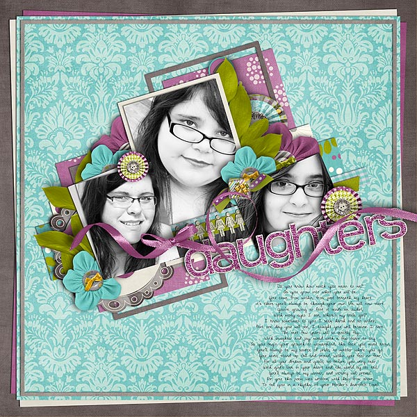
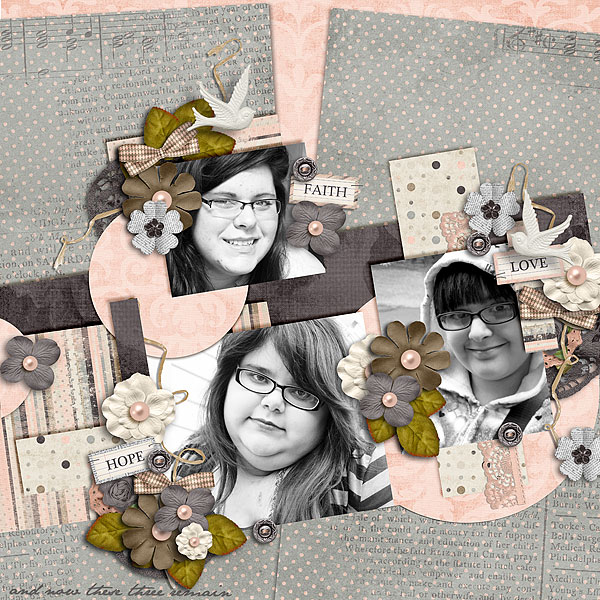
And these next two examples is probably the most common reason I use b&w. When I do a layout with multiple pics, I want them to all have the same exact coloring. But if it al all three girls sometimes the pics were taken at different times, if it is the same kid they might have different clothing on or the lighting is off in one and when fixed still doesn't match the other pics, ykwim?

daughters1.jpg


thesethreeremain.jpg
 
Thanks everyone! I think I'm going to challenge myself to use black and white on a layout this week. Like I mentioned in my first post, I have no problem with black and white hanging on the wall or framed at home. Odd, huh? I was thinking about it yesterday as I removed two new photo plaques from the Shutterfly package. They are black and white pictures of my kids and I love them but go to scrap those same pictures I and I reach for the color version.
 
LOL I think like 70% of my layouts are either B&W or sepia-toned. :) It's an easy-peasy way to get all my photos to match the kits!
 
I don't convert to black and white as much as I should... haha... I usually use it to convey emotion to support the story I want to tell... and like Traci... there are times that the kit doesn't match 100% to the photos, and I'm okay with living it in color - as long as it doesn't clash... it's all about the story.... at least to me. ;)
 
Another option is using a vintage effect (I use Lightroom Presets, but there are a lot of great actions out there too) to take down the saturation on photos and make them more "scrapable" with different hued kits.

Here are a few examples:


Jenn, that's what I do. I have a few actions I've made to either bump up the saturation, add a pale misty effect, a vintage-y hue, or tone down the colors. If I really want the photos to be color and they don't match a kit, I try those actions first before settling with B&W.
 
We have an issue in my house where I love B & W and my husband hates it and says the exact same thing as you. That you lose something in the layout if the photo is B & W and for him the LO's are all about the photo and what we were doing at the time and not for "art" sake. So it's hard for me especially since I LOVE B & W but I try not to use them as much as I would like.
 
I see what everyone means by some of the emotional value being lost (for example, obviously a photo of me in a green dress on the beach loses some of it's WOW if I black and white the beach and sky and green dress... or, when the shirt Zach came home from the hospital in was a Red M&M shirt, it would lose some of it's oomph or emotion if I turned it black and white), but at the same time, since I take so many shots at an event, even if I do make them black and white, there are certain to be other pages in the album featuring photos from that day/event/etc in color. :shrugs: It depends on my mood, but I've been using black and white more and more.

And, in some of them, I actually feel like the black and white helps convey MORE emotion for me than the color version of a photo.

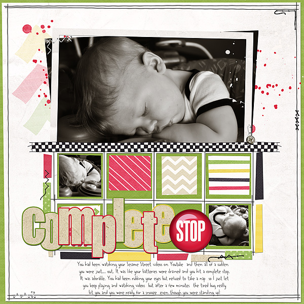
complete-stop.jpg

To me, from the very second I took the photos, I knew that I'd love to use them in black and white. I *could* use the color version, but the B&W speak to me more.

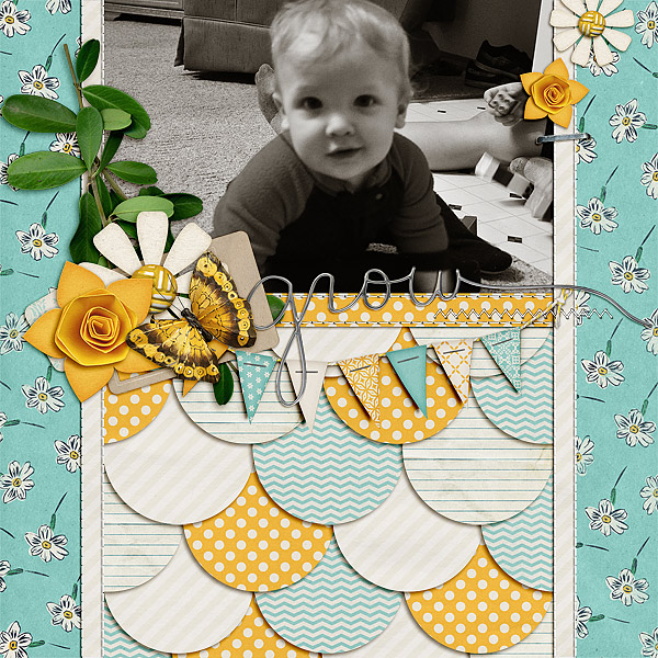
grow_.jpg

In this one, he is wearing a bright red and blue sleeper. It doesn't match the kit at all. Someday, I may scrap the photos in color using a lego kit because it's from a series of photos of he and Jeffrey playing with Legos, but honestly, at this point, it's just a cute photo as-is, and I don't need to see the color detail- I have a billion pictures showing off his blue eyes, probably about 100 of him in that particular outfit, and plenty featuring the dusty mauve of my grandmother's chair in the background. Those details aren't as important to me as his expression, and because he was in motion when I took the shot, it's not completely in focus-- the B&W adds a little poignancy to an otherwise "eh" shot.
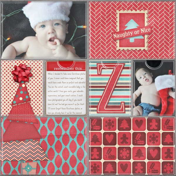
Christmas-Photos-for-Zach.jpg

I left these in color because his outfit matches the kit perfectly, and I just didn't like the black and white versions as well. I felt like the kit captured the colors well, and I felt like he just looked perfect and cute in the shots in color. Shots like this will help me remember exactly how his eyes looked as a baby, how smooth and clear his skintone was, and how blonde his hair was.

I think a good mixture will still tell the story, for me personally, but it's all up to personal opinion!

 
I love B&W. I've been working with my photos a lot more these days and discovering different things within my program that I can use to improve them. Jen your examples are so inspiring to me. Sometimes I wish I used Photoshop so that I could pick up those actions, but I do learn a lot going through the trial and error process with PSP.
 
I LOVE b&w & sepia photos - I used to use them all the time on my early-early layouts. But my hubby mentioned (just randomly) that he really doesn't like non-color pics. He just likes seeing the colors from the day - it feels more real to him. And since he rarely shows any personal interest in my photos, lol - I felt like I should include his preferences in my scrapbooking (they're his memories too) :D
 
I love color photos but I also love the classical, elegant touch that a B&W or sepia photo gives to a LO! :)
 
I've had the color vs. non-color discussion with my husband many times. He prefers color UNLESS it's a vintage wash / desaturation and then he'd prefer b/w. If he wants pages with all color photos, then he can scrapbook them himself.

guys are weird. period. :p
 
Back
Top