Well, I'm not the queen of clusters, but I got considerably better after I forced myself to use more elements on a page. I find that Cindy's templates are excellent for learning both, clusters and titles. While I do change them, I sometimes tell myself: Trust the template! They are usually VERY well balanced, so even if in between you doubt the look, stick to it til the end. Really do replace the placeholders with elements.
An important thing for me is to plan ahead. When I start with my page, I carefully pick my template/design style and kit. Usually I start with the pictures. Then I consider templates and kits matching them. When I look at a template, I also check the kit if it will work for the page, I have in mind. If I need lots of paper blocks, I will quickly check whether I have enough options. What type of elements the kit holds and if they will work for the clusters. Do I need wordstrips, journal mats, ribbons, scatter ect? When I look at the kit and the template, do ideas form in my mind what to put where?
For me looking at my options I need a general idea of the page forming in my mind. I find it very hard to scrap without that feeling of: This will work! I can see it coming together!
If I don't get that impression, I either consider other kits, templates or even completely different styles.
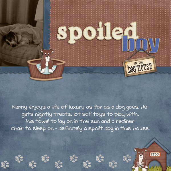
For the titles it's the same. A sure way to hate your titles is when you scrap first and then put a title somewhere in the end. A title is not addition, it's a design element. Just like a cluster or embellishment. So when I pick my template or make a mental sketch, I know before I start: Where do I put my title? Again, Cindy's templates rock at this. I think of how many words I want, which word I want to emphasize (i.e. use the biggest alpha for), where I want subtitles to go. Sometimes I adapt templates there, but I check if that's possible before I start.
Not always, but mostly I also know what type of alphas I want. Bold and bulky? Crafty? Metal? Brads? Then I scan my collection for good options, sometimes stumbling on something that makes me re-think, but more often sticking with my original plan.
")