SweetChar

Happy Birthday To Me

  • Media owner SweetChar
  • Date added
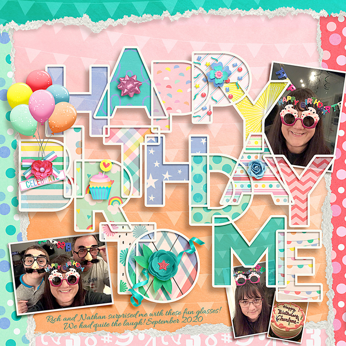
Making those letter/words and filling them to me a "moment." Ack! lol

I had some questions about how I did the cut-out letters. My instructions might not make sense, but I posted them in a comment below. Also, it looks like there is a free template somewhere (a different site) that says Happy Birthday To You. I didn't know about it, so made my own version.

February 2020: Passport To Party #2: Product: Birthday Anniversary Freebies
and
Birthday Party Challenge: February 13th - Paper to Digi

Used free items collected so far for the birthday celebration: You Say It's Your Birthday from SSD and
A TAD TORN V.1 | CLIPPING MASKS by The Nifty Pixel
https://www.sweetshoppedesigns.com/sweetshoppe/product.php?productid=46042&cat=&page=1
Wow! Wow! Wow! Your shadows are amazing!! I love the torn papers and the cute photos as well. What an amazing layout. LOVE your take on the challenge! :wub:
 
OMG... wait a minute you did the big cut-out all yourself! GURL... I AM SO IMPRESSED!!!! This is so perfect. I have to go to the doc now but maybe I'll follow in your footsteps!
 
The cutouts are amazing, I'm sitting here trying to figure out where to even start to create that kind of look because I love it, but I am lost lol (feel free to PM me with your secret! lol!). Love everything about this, love your take on the challenge!
 
Amazing job cutting out all those letters & layering them ... was trying to figure out if there is any easy way to do that -- the effect is stunning! Beautiful LO!!
 
Let's see if this shows up. It's a lot. lol Someone else asked about this and I see it asked here. I see that some people are getting a similar free template somewhere. This was my reply to someone a moment ago:

Hey. I don't know if I used the best, easiest or fastest method...but here goes.

I used the free alphas (from LJS I believe) and arranged them where I wanted them. Then I gave them all an inside stroke (chose a near-white color) using the styles panel. I took the opacity of the letters all the way down in the styles option so just the stroke was left showing. I duplicated all of them (in case I messed something up. lol) And hid a set. Then, if I recall, I merged the unhidden letters together. So, now all the strokes were one piece. Oh, I had to fill in the middles of the A, B, D, etc before the stroke so the holes didn't show. I just used a brush stroke on them knowing that the opacity would be turned down and you wouldn't see it. I noticed, later, that I forgot to do that process to one. Oh well. lol

There's more... I took the stroke frame (as I'll call it) and made a duplicate. Always duplicates! lol I took one frame and merged it down onto a duplicate set of letters and put that on the bottom layer to make the big shadow. Then the frame that was on top of the letters I gave a really small shadow. But...I went back later with a mask and removed the part of the shadow that showed on the "outside" of the letters. I just wanted it on the insides.

Phew! Now for the paper fillers. I pulled a paper underneath the frame. Gave it a mask. Went to the frame later with the magic wand and selected the area to put the paper. Then did "select inverse" and went back to the paper layer mask and dumped black paint there which masked out the paper everywhere except where I wanted it under/in the letter. I did that with a new paper for each letter.

Then I reduced the opacity of all the papers just a little bit. Possibly a vellum effect?

I hope I didn't leave out anything. And I hope all that made sense. If not, let me know. I have to run some errands with my family, though.

I just took a look in case some of that you weren't familiar with... to reduce the opacity but keep the stroke...when the layer style window pane is open, at the top left (on my computer) it says "blending options: custom." Click on that and go to "fill opacity." Change that to 0. The stroke option is on the left of the window at the bottom. From there you can choose the color, size and placement. I used "inside."

Again, hope all that made sense. There is probably some quick, easy method and I just go about it the loooong way. lol
 
Guess I can't edit the comment. The letters/frame on the bottom for the big shadow...I made the shadow it's own layer then turned off the letters/frame layer. I think. lol
 
wow! This looks amazing! Love the layering, the titlework, the softer colors you chose! (I also love that you gave us directions on how you did it! So nice of you!) Beautiful page!
 
Yeah congrats for the title you did yourself! This is amazing!
Love how you did this challenge and your layout is really beautiful!
 
Wow! This jumped out at me! Such an awesome job of the paper to digi challenge! You did a great job on the cut out letters!
 
Oh man, I was coming here hoping to find a source for a template... sounds like a lot of effort to make that lettering ;) Beautiful, eye-catching page!
 

Layout information

Category
Our Community
Added by
SweetChar
Date added
View count
789
Comment count
20
Rating
0.00 star(s) 0 ratings
Back
Top