What Fonts do YOU use for Journaling?

amyjcaz

Active member
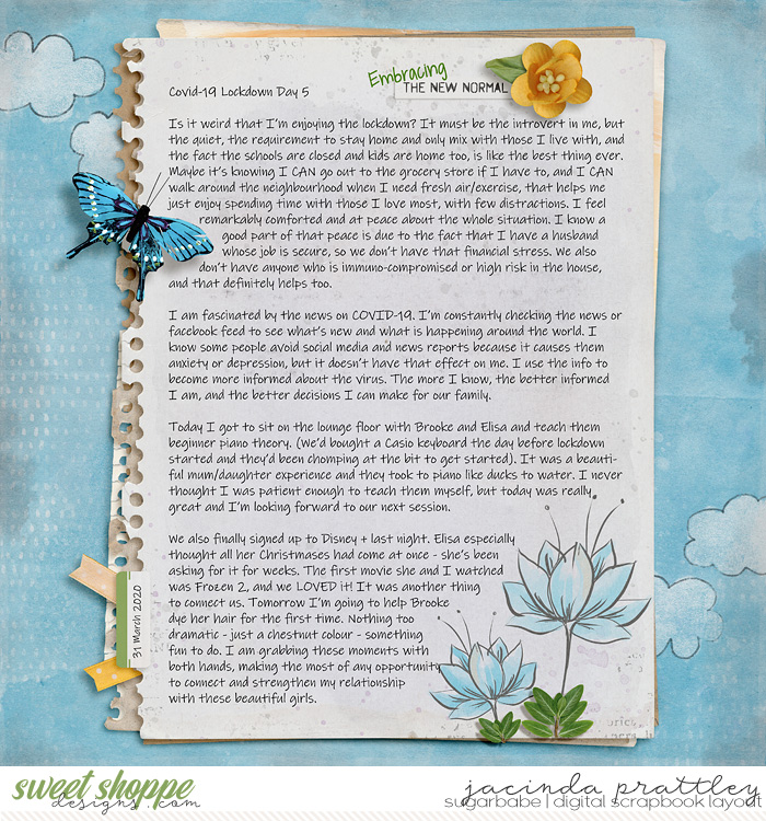
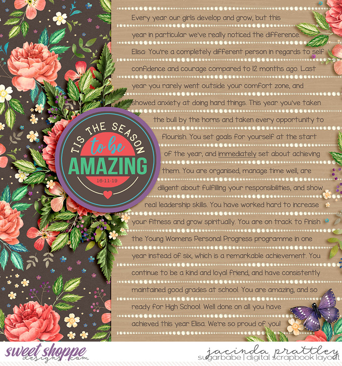
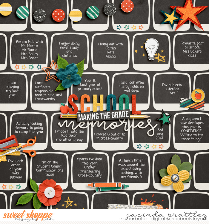
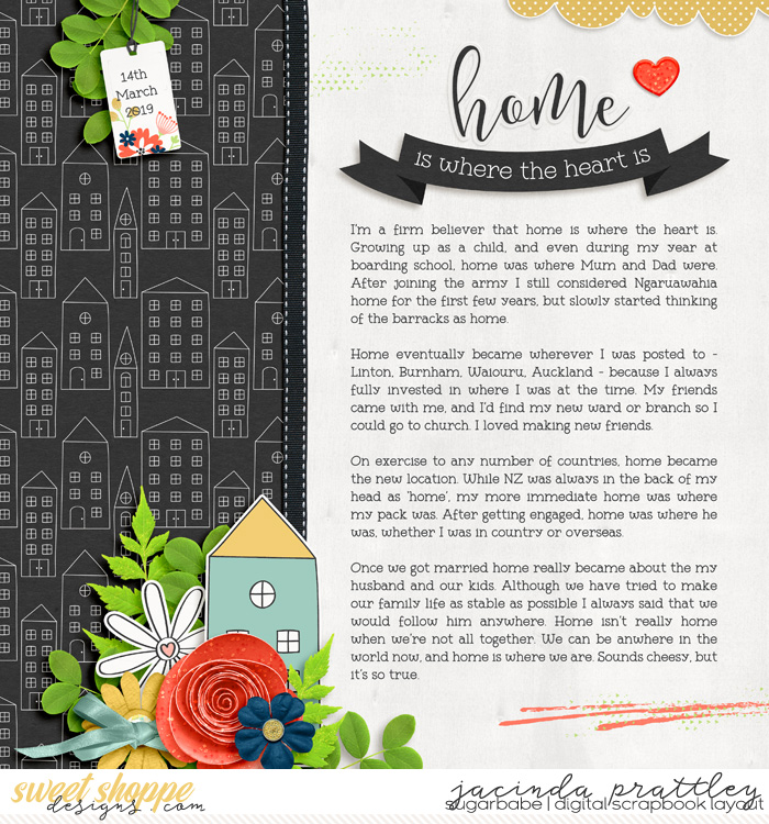
I would love some suggestions on fonts you use to journal. I am usually good with fonts and use all different types for titles, dates and word strips. But for journaling it has been super hard to branch out! I want it to be easily read and clean, not too cutesy or fancy. I almost always use Century Gothic and I am just so tired of using it all the time! I will also use a typewritter style now and then, but I am looking for some good strong fonts that you ladies use. Thanks in advance for any help!!! :)
 
So one my kids has several learning disorders and we discovered, after printing a couple of albums, that she can't read the journaling. This year, I've decided to ONLY use Traveling Typewriter because it's a font that EVERYONE can read--including aging grandparents
 
I have a custom font of my handwriting that I like to use a lot. If I'm not using that- my other go-to's are Lifesavers & Albertsthal Typewriter

I will add- I'm a total font hoarder & these are just the ones I've been using lately- until a new fave comes along! ;) ;)
 
I had my own handwriting turned into a font for when i want my journaling to look as realistic as possible. I don't much care for my own handwriting though so often I'll use one of DJB's fonts or I'll use Abadi MT (light) for my pocket pages.
 
Century Gothic is one of my faves too, but when I want a more handwritten look (but still easy to read) my go to's are:

Ink Free font:


KG Miss Kindergarten font (I probably use this one the most):


Coming Soon font:


Night in Rome font:


Nexa Light font:


DJB Number 2 Pencil font by Darcy Baldwin:

 
Last edited:
Great thread!

I personally use my own handwriting font for 99.5% of my journaling, i had it made years ago when Darcy was still here.

I love all those Jacinda shared. I need to download some of those, because I do like to use things like that for titles, and weirdly for layouts I'm doing in my all about me album, I don't always use my handwriting for that. I will use century gothic I'm doing like facts about a place or something.
 
I love threads about fonts!!
I spend WAY too much time deciding on a font to use for my journaling.

I've considered using the same font all the time, but I love trying to match the font with the LO theme. It would save A LOT of time, though. :D

Jacinda, thank you for sharing these!! I picked up several new ones!
 
I use KG When Oceans Rise for my travel album


And I use Josefin Slab Regular for my yearbook

 
I always use the same font, and it makes my life much easier! I will sometimes use other fonts for title work or subtitles/dates. My font is called Typewriter Condensed.

allyanne_StayingHome_01_WM.jpg
 
My go to: All Things Pink, Alexis Marie, Anjelika Rose, Georgia Belle, Give it Your Heart, Hello Annie, and Isabelle Layne. They are very similar.

I am a font hoarder and tend to go through phases where I will only use print fonts, then it will be script fonts. I do like to mix it up but have my faves.
 
Century Gothic is one of my faves too, but when I want a more handwritten look (but still easy to read) my go to's are:

Ink Free font:


KG Miss Kindergarten font (I probably use this one the most):


Coming Soon font:


Night in Rome font:


Nexa Light font:


DJB Number 2 Pencil font by Darcy Baldwin:


thank you jacinda for those great suggestions. I really like the first two fonts and have already downloaded them.
 
I am like Wendy. I've found that my journaling is hard to read in some of my old albums when I chose froufier fonts, so I am choosing fonts that are extremely readable for most stuff now. I like American Typewriter for my serif journaling font and century gothic for my sans serif. Still trying to find a good handwritten font - my handwriting is very messy, so no one will ever think that any handwritten font in my journaling is mine LOL I'm just looking for something very readable. I like Jacinda's suggestions above!
 
Last edited:
I love fonts thread! :thumbup:
I also spend a lot of time deciding what fonts to use but I have few favorites :

Pickandroll font :


Funiko font (I found this in one of typography challenge) :


hello ali : (I think someone mentioned this font here)


I just realized they all look similar :D
I also like VeggieBurger font, Just the way you are font and for typewriter fonts I like Tight writer, travelling typewriter and 1942 report
 
Oh my I LOVE fonts.... I have so many... but I tend to have favorite that I use for a while then move on to new favorite.
Currently Buttercup is my fave for titles. And I LOVE KG fonts and handwritten fonts for my journaling.
 
A few months ago I spent a lot of time scouring font sites for something that was relatively compact and would remain easily readable at a small size. On my Project Life pages I have sooo much text to squeeze in! My favorite ended up being KG Thinking Out Loud. It looks like a chunky, big font, but it can go surprisingly small and still be very easy to read.


I also use Hollywood Starfire a lot. I think it may have been from an SSD challenge a few years ago. It's easy to read and fits on lots of different page styles, but if I test the same text in this and KG Thinking Out Loud, I can fit in more text legibly with the KG font.


I use these fonts for almost all my journaling. I also don't use scripts, except maybe for a word or two in titlework. My kids find all scripts much harder to read than print and at small sizes I think they're usually hard to read.
 
Last edited:
My favorite is any style of typewriter font. But sometimes I will change the font based on the layout. If it's a girly layout- scripty font. I used a pieces of eight font for my pirates layouts. It really just depends on if I want something more themed. Otherwise, it's typewriter!
 
Once again... thank you all so so much. I do a lot of font searching and collecting but with just this one thread I now have so many instant go-to journaling fonts! It's like Christmas and Birthday all rolled into one!
 
You guys are feeding my font addiction. I'm still using some old Fonts for Peas fonts. But I'm loading up here...
 
I love Special Elite for a typewriter font. I use Open Sans Condensed a lot. It's a great font for legible reading, and it's good when you need to squeeze in a lot of info in a small space. I use it in my design work quite often as well for things like wordy strips.
 
I have way too many fonts (but really, is there SUCH a thing?! LOL!) So I use whatever font I find that strikes my fancy at the moment!!
 
Darcy made my handwriting into a font. There's 2! You can find them on dafont.com now

DJB Brit's Thin Pen
DJB Brit's Thick Pen
 
Back
Top