
A little help please; shadowing again

LJSDesigns

Sweet Shoppe Designer
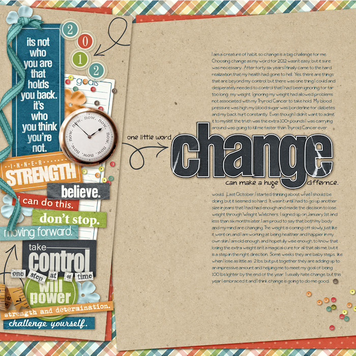
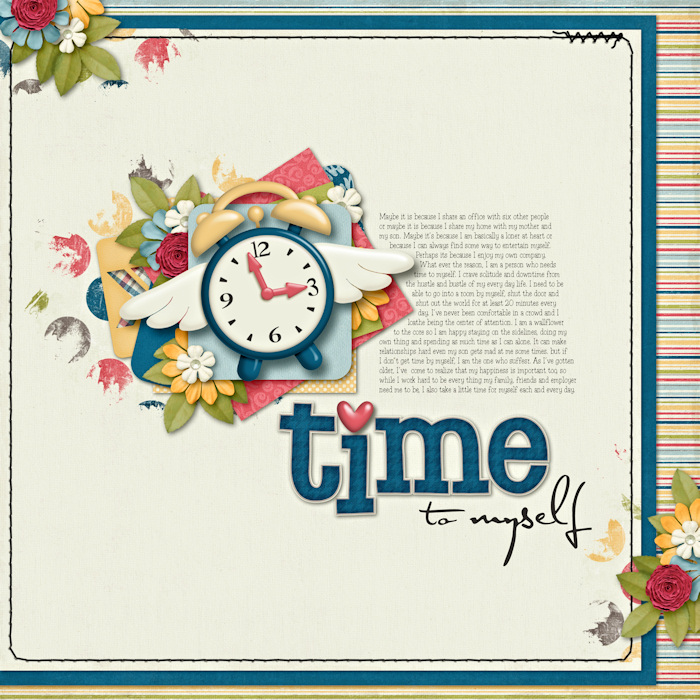
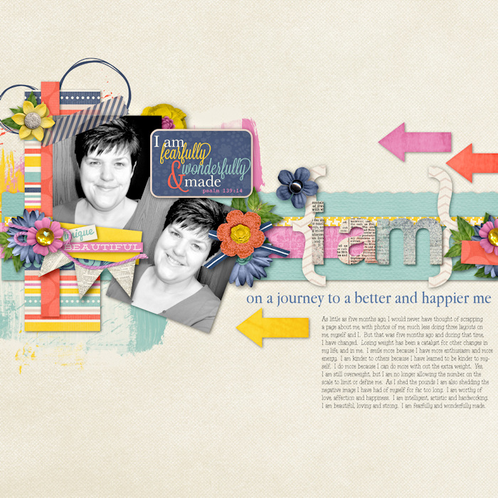
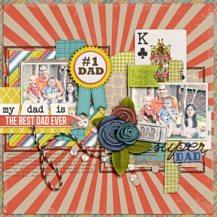
I've been working really hard on my shadowing since I started hanging out here in January and I have to ask, is it any better? I've incorporated some styles and blurs and try to shadow differently based on the distance and weight of elements, but I am still not sure I am getting it any where near right. :unsure:

I do study a lot of pages in the gallery, especially the ones that have such great shadowing and try to learn from them, but am still questioning where I am with this skill. No one has ever once said, great shadowing Lorie, so I think I have more work to do. :D

I like my shadows to be realistic looking, more than dramatic, so if you have time to look at my gallery and don't mind sharing your opinion or tips, I would be so grateful! :wub:
 
I just looked at about 5 or 6 LO's from your gallery and I think your shadowing looks really good. :)
 
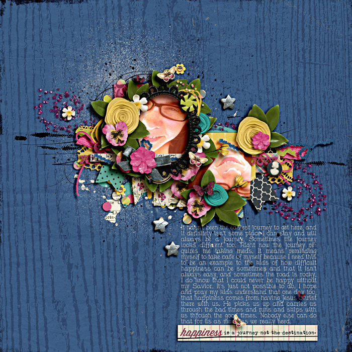
I think your shadows are looking great, Lorie!! I especially love this layout & think it looks very realistic!!


My preference is towards slightly darker shadows BUT I don't think lighter shadows look unrealistic at all and I think you've come a long way in your shadowing journey. This is not to say your older pages are BAD, I just think it's noticable that you have been trying to work on your shadows. That is to say, what you're doing is working! Your gallery was a treat to look through!!

(ps - I am, by NO means whatsoever, a shadowing expert or anything of the sort! ;))
 
I think your shadows are looking great, Lorie!! I especially love this layout & think it looks very realistic!!


My preference is towards slightly darker shadows BUT I don't think lighter shadows look unrealistic at all and I think you've come a long way in your shadowing journey. This is not to say your older pages are BAD, I just think it's noticable that you have been trying to work on your shadows. That is to say, what you're doing is working! Your gallery was a treat to look through!!

(ps - I am, by NO means whatsoever, a shadowing expert or anything of the sort! ;))

Thanks Sara. I have actually been wondering if I should make my shadows darker, so your comment is much appreciated! I think I may try darkening them just a tad on my next layout. Thank you too for your compliment on my gallery. It was sweet of you to take a look and help me out. This community rocks!! :)
 
See, I have the same problem Lorie (and by the way your layouts look great to me!). I tended to shy away from overly dark shadows because to me they just don't look realistic, but I've been trying to darken mine a bit too. I guess it's just a matter of personal taste. I don't mind making them "deeper" for larger, bulkier objects, but too dark just looks odd to me :D So I think some of that is personal, but maybe not! LOL I also don't have as much to work with because I use PSE and can't do the linear burn that I hear so much about.
 
Last edited:
I think your layouts look awesome and I think your shadowing is wonderful. One suggestion I would make is to make the "higher" elements with darker shadows, you know like the flowers and buttons and that stuff.
 
I love your shadows in this one - they seem to fit perfect for the element/paper - what it is and how far it would be off the paper...


I'm not an expert on shadows at all. I get lazy with mine, and really don't spend a lot of time on them. I have a couple styles i use, and I've saved more as I tweaked those styles to fit what I wanted them to. I hate to spend a lot of time on them. I know I have a ton of room for improvement, but when I'm finishing a lo I just can't make myself take more time on them :( *sigh, I really should though!
 
Thanks for your help Marie, Paula and Brie. :)

Marie, when I do darken it will be just a tad, at least to start. While I love the dramatic look that some scrappers can achieve with dark shadows, I can't make it work for me, but then I can't make eye shadow work for me either. :D

Paula, I can see where those elements should be darker. Should they also be bigger and blurrier? I get confused because as I layer my elements, I make the shadow bigger, blurrier and lighter. It seems to be that way in real life. (But please understand my reference point is a tangle of computer wires on my desk.)

Brie, I wish I could use styles, but I use PSP and there are not styles out there for it. The good thing is that I have total control over my shadows and can write a script once I get something that makes me swoon. I really am trying to improve my layouts in every way and since the shadows provide the realism, I am okay with the extra time. But then I am not a fast scrapper anyway, so it is all good. ;)

Hugs to you three wonderful ladies for helping me out! Thank so much. :)
 
I think your shadows are great! I wouldn't go any darker than you have already. Personally I like lighter shadows anyway. I did a mini tut on the blog about using lighter shadows (with lighter kits) HERE. I think you have a good balance for darkness in your shadows, and wouldn't change a thing.
 
Hey Lorie,

No question your shadows have greatly improved. I really think you're on the right track.

Don't be scared to experiment some. if you try the darker shadows you could save the same layout with darker and lighter ones and see which looks better to you side by side.

YOU ROCK!
 
I think your shadows are great! I wouldn't go any darker than you have already. Personally I like lighter shadows anyway. I did a mini tut on the blog about using lighter shadows (with lighter kits) HERE. I think you have a good balance for darkness in your shadows, and wouldn't change a thing.

Thank you Jacinda, you just made my day! :wub:

I used your tut on my peek a boo layout and the one I did for my dad and loved the results. It just looked so much more natural, which is what I am going for. I love that you all take time to do the tuts and share your knowledge because I love learning from the best. :)
 
Hey Lorie,

No question your shadows have greatly improved. I really think you're on the right track.

Don't be scared to experiment some. if you try the darker shadows you could save the same layout with darker and lighter ones and see which looks better to you side by side.

YOU ROCK!

Awesome idea Alisa!! What a great learning tool. Thanks for being such a sweetie. I told my son some one said I rocked and his reply, "do they know you irl." :D
 
Lorie, I agree that your shadowing looks great! I'm another that typically uses shadow styles, although I do tend to tweak them a lot. I just took a peek at the flower vs paper shadows and the paper shadow is darker than the flower shadow. That's how I tend to think of it, too. The farther away, the bigger, blurrier, and lighter. And for some of the elements (like the 3-D flower), there's a bit of an outer glow put on, too.

Have you printed any of your newer layouts? I'd think that would be the true test of how dark the shadows should be in general. I remember an episode of The Digi Show where Peppermint Granburg was discussing shadowing and she said that she makes her shadows darker than she thinks they should be so that they look right when they're printed.
 
Outer glow? I've never tried that. Sounds like I need to. Thanks for mentioning it Kate. I have not printed anything at all yet, I am so scared to, but I know I need to put on my big girl panties and just do it. After all that is the true test, isn't it. Thanks again for taking a look and sharing your knowledge Kate. :)
 
Well, I LOVE the lighter shadows. LOVE LOVE LOVE. I think they look very natural, real and graceful.

I wonder sometimes when people suggest darker shadows how their monitors are calibrated. I mean, sure, if I left mine at factory settings, those lighter shadows might look washed out, but they are exactly how I love them when I print them.

This layout is such a great example of how well I think you're doing the shadows. It's easy to see the diference in depth from the tape to the papers and photos to the flowers and foliage. There is a sense of touchability. If a little breeze came through, I can see how it would lift a petal of a flower...something you just don't always feel with darker shadows.

 
Thanks Krystal! Your opinion means a lot to me, so I appreciate your response. :wub: What you described is exactly the feel I am going for, so I am super happy right now. Maybe I am on the right path after all! :)
 
I just wanted to reiterate that the darkness vs. lightness of shadows is in no way a hard & fast rule - I prefer mine a little bit darker but I also love pages with lighter shadows. I think your pages are looking awesome, really.


This is me being sick and feeling like I was telling you that you should darken your shadows because everyone is doing it. :( I'm sick, I should just shut my trap, I think.
 
there is definite improvement... and I really like the layout that Krystal posted... I think if you're happy, then you should stay happy with them :)

there are some things you can do to make them a bit more realistic, but I'm not sure if you can do them in PSP... can you seperate the shadow from the element so it's on it's own layer? The reason I ask is because in the layout that Krystal posted, you tuck bigger 3D items underneath things like papers and photos and if you can separate the shadow, you can tweak the shadow by smudging or warping so that the shadow looks like it's bigger under those bigger items, and still smaller away from those items... like the photo wouldn't be flat on the paper since you have the bigger element back there, so you wouldn't want to have your shadow be flat... does that make sense?

But again... that's just me speaking from personal taste, and I firmly believe that if you like your pages, then you should be happy with them... because your family isn't going to care if the shadows don't look right on everything, they just want to see the pictures and read the story :wub:
 
But again... that's just me speaking from personal taste, and I firmly believe that if you like your pages, then you should be happy with them... because your family isn't going to care if the shadows don't look right on everything, they just want to see the pictures and read the story :wub:

well said. :)
 
I just wanted to reiterate that the darkness vs. lightness of shadows is in no way a hard & fast rule - I prefer mine a little bit darker but I also love pages with lighter shadows. I think your pages are looking awesome, really.


This is me being sick and feeling like I was telling you that you should darken your shadows because everyone is doing it. :( I'm sick, I should just shut my trap, I think.

Heck no you should not shut your trap Sara! I asked and you answered and I appreciate it so much. Like I said, I was thinking about darker shadows, but just wasn't sure. Alisa had a great point about doing the same layout with darker and lighter shadows and then deciding which I like best. I know that shadowing is all about taste and preference and I am still trying to perfect mine. Your opinion is going to help be get better and I appreciate that, so don't feel sick or shut your trap. PLEASE. :hugs:
 
there is definite improvement... and I really like the layout that Krystal posted... I think if you're happy, then you should stay happy with them :)

there are some things you can do to make them a bit more realistic, but I'm not sure if you can do them in PSP... can you seperate the shadow from the element so it's on it's own layer? The reason I ask is because in the layout that Krystal posted, you tuck bigger 3D items underneath things like papers and photos and if you can separate the shadow, you can tweak the shadow by smudging or warping so that the shadow looks like it's bigger under those bigger items, and still smaller away from those items... like the photo wouldn't be flat on the paper since you have the bigger element back there, so you wouldn't want to have your shadow be flat... does that make sense?

But again... that's just me speaking from personal taste, and I firmly believe that if you like your pages, then you should be happy with them... because your family isn't going to care if the shadows don't look right on everything, they just want to see the pictures and read the story :wub:

Yes Heather that makes sense and it is something I can do, so I will need to work on it. Thank you for your suggestions. And you are right about my family not caring about my shadow work. I doubt they notice it at all. ;)
 
another thing I thought of... in natural settings, shadows are darker on dark background and lighter on light backgrounds... I usually just change my blend mode on my shadows to linear burn because this automatically does it for me... here's some examples of what I mean...

in this layout, you can see that the shadow of the papers against the background are darker over the red part of the starburst and lighter over the tan part of the starburst, that's just from changing the shadow's blend from normal or multiply to linear burn...
fathers-day-2012-7001.jpg


see how the shadows are darker against this dark blue background
sgleason_jbarrette-chin-up700.jpg


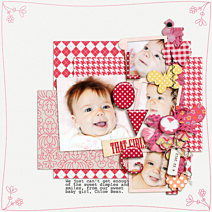
vs. being lighter against the white background... and my shadow settings are exactly the same for both layouts...
love-that-girl700.jpg
 
I don't have linear burn in PSP, but I sure wish I did. I am not sure how I would get the same effect, but I can try some of the other blending modes. The best two I have found are multiply and luminance legacy, which is the one I use the most. It seems to give a softer, glowing shadow. :)
 
I used to study shadows on paper layouts. I'd go to a gallery that I knew paper scrappers used to show off their stuff (hybrid stuff here works too - but I prefer layouts to show me how shadows look on buttons, papers, flowers, etc) and it really helped me understand how certain things work (button shadows are bigger than I thought they would be, for example).

I think your shadows look fantastic. I bet you're not getting specific comments about your shadowing cuz you don't do heavy clustering. I find I get comments about my shadow work when I do some clustering of flowers or something similar. So I wouldn't read into that! :) And I don't think they're too light - but it can't hurt to experiment. I too fear my shadows are too light sometimes. I go back and forth all the time on my darkness - I can never seem to find a happy middle.

As for not having linear burn - can you change the color of you shadows? I haven't used PSP in a long time and I don't remember if you can. But if you can, then you can trying to change the shadow colors to match closer to paper colors - it can sometimes help when a shadow looks dull (shadows on white paper, I think, are the worst. I like to change the shadow to a brownish color to soften the dullness).

But yeah - you've definitely been honing your skills. Shadowing can be really tricky and you have really done your homework, imo :)
 
Have you printed any of your newer layouts? I'd think that would be the true test of how dark the shadows should be in general. I remember an episode of The Digi Show where Peppermint Granburg was discussing shadowing and she said that she makes her shadows darker than she thinks they should be so that they look right when they're printed.

I was going to mention something very similar to this. I tend to be conservative when it comes to my shadowing. I start to become uncomfortable when my shadows are either too dark or too big, etc. I am originally a paper scrapper and I tend to keep things on the 'flat' side. I like depth but I am afraid of over doing it and having something that doesn't look realistic, in other words. I recently did some layouts and had them printed a variety of ways. I realized in seeing the finished print projects that I could have been a lot more daring with the shadows and it still would have looked just fine. My shadows were good but I wish I had gone more bold so that they popped more when printed.
 
When I first started my scrapping journey, I started with PSPX2. I will try to explain what I've learnt.
Please ignore my spelling mistakes :o

You can put the shadow on a seperate layer and change the color. This was something I didn't realize for a long time...
1a.jpg


You can then duplicate the shadow layer (2 times)
2a.jpg


You can set 1 layer on linear burn and pull the opacity way back and then give the other layer a gaussian blur and set the layer on soft light.
3a-1.jpg


4a.jpg


At the end you have 3 shadow layers. I like to put the one with the blur first, it gives a kind of outer glow effect,
then the normal one and on top the linear burn.
You can play with all the opacities, untill you like what you see...
I think this method works great for things on top that need a little extra "pop".
 
Last edited:
I think a lot of us are struggling with shadows. I am also kinda struggling.
I have been trying to follow Jacinda's turorial. But I noticed that a lot of those tutorials are written for CS5...or full programs and not for PSE which I use. But for me...now...they look fine.

I looked at several layouts....and I think your shadows are great....when I am checking out the gallery I see the whole layout. Colours used, composition, use of flowers etc. And then....the shadows...hahaha.
 
I, too, think your shadowing is great Lorie. :)

What I feel takes the shadowing work to the next level is some playing with smudging/warping. I use the smudge tool (because I haven't the warp in my old moldy version of Photoshop :) ). It takes some time but I actually love playing with it.
Like Heather mentioned, you can tweak the shadow on a few places to achieve the realistic effect of elements tucked under the photo/paper, or you can mess up the flowers/leaves shadow a bit, or play with the shadows of ribbons, bows and curled ribbons to give them a more realistic look.
 
I can't thank you all enough for taking the time to help me with my shadowing. I really appreciate it. I am going to take all your suggestions and lessons and put them to use on my layouts. There are a number of things in this thread that I want to try and I can't wait to get started. I just wish I had more scrapping time. Hugs to you all. This is the best community! :wub:
 
Back
Top