Such an interesting topic! I think I could pontificate on this one all day

hahahahaha
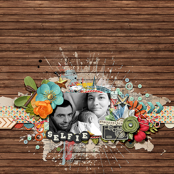
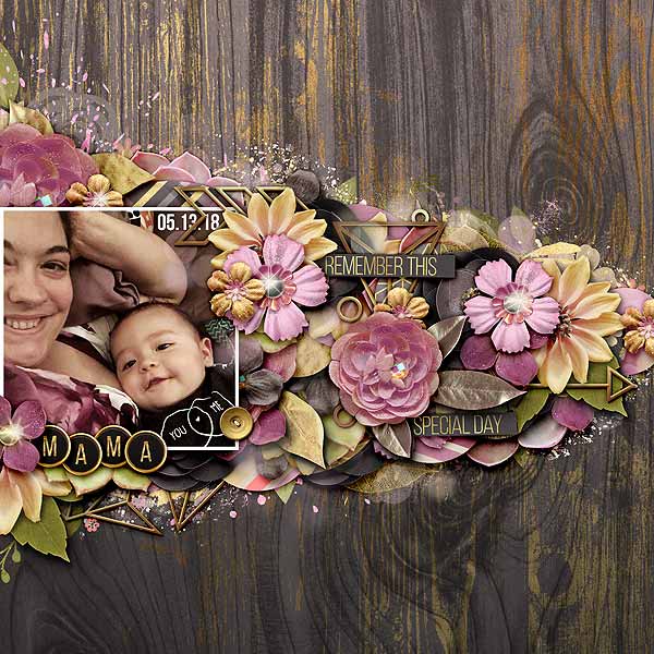
One method I use is to utilize blend modes to emphasize that the paint splatter or words are directly ON the background paper, then adding elements on top of it to show the depth. Kind of like this:
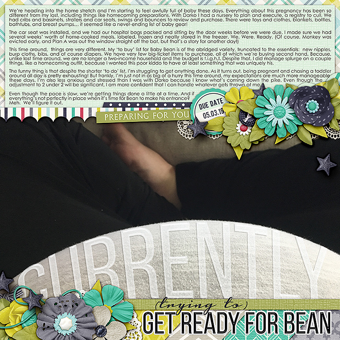
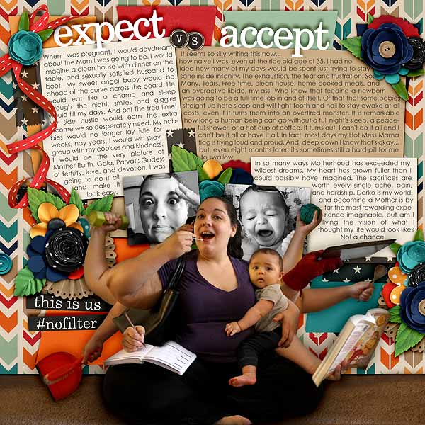
Another way to add depth is directly through the photos you choose. This works especially well on large photos! Like in this first example, the angle of the photograph emphasizes my pregnant belly and holds the title of the page.
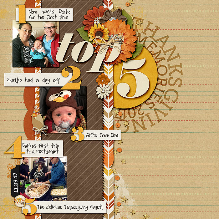
Some other examples of how a photograph can create the illusion of depth...
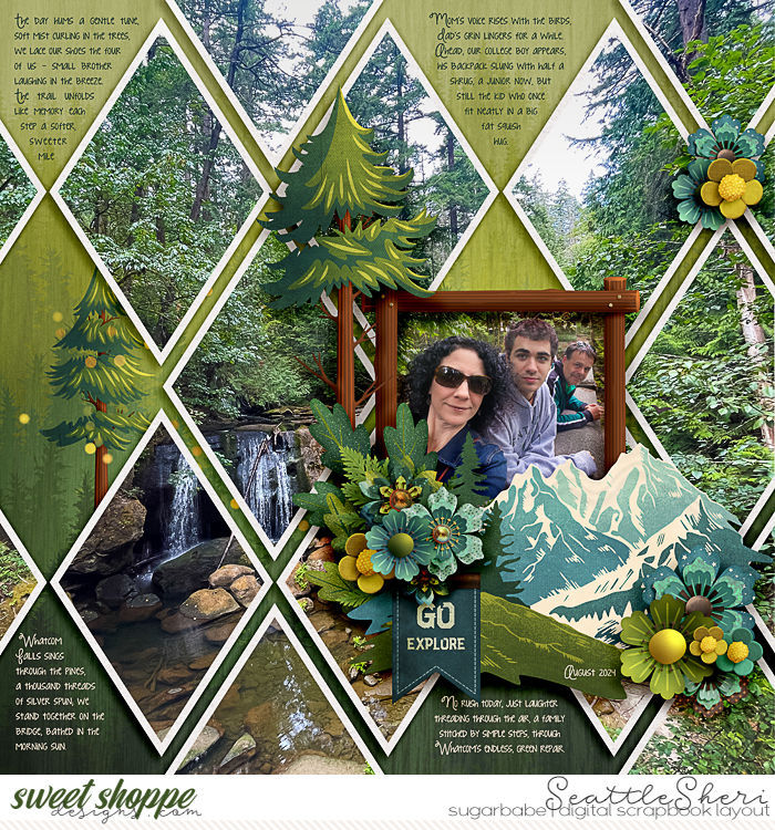
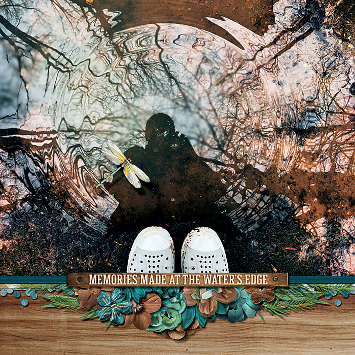
In this page I used an extraction in front of the collaged wall to create the illusion of depth.
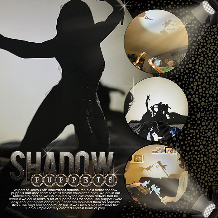
Like others have said, even with these tricks, it really comes down to shadowing. Nothing makes a digital scrapbooking page fall flat (pun intended) like a lack of shadows.
Big shadows can have a big impact, but even the smallest shadows can create an unmistakable layering effect that mimics the look of paper scrapping. There are times when I use uniform shadows across a page, and times when I work hard to vary and warp my shadows. There's no wrong way to shadow, but the way you shadow can make a huge difference to the eye.
One of my favorite ways to use deep shadows is on title work


")