TraceyM
Sweet Shoppe Designer
Since one of my normal AI chat sites is currently considered as uncool to go for due to it's recent actions, I decided to try out Claude AI. I asked for the top 25 elements that should be in a digital scrapbooking kit. I'll post it here but I'm curious as to what else YOU think is important and do you even agree with it's listing.
------------------------------------------------
Here are the top 25 elements every digital scrapbooking kit should include:
Foundation Elements
Solid-color cardstock papers — A full palette of 10–15 coordinating solid papers. These are the most-used items in any kit; scrappers rely on them for backgrounds, mats, and layers.
Patterned papers — At least 8–12 designs mixing large-scale prints, small-scale prints, and geometric/textural patterns. Variety in scale is key.
Photo mat/frame — A simple, clean frame or mat for anchoring photos. Every layout has at least one photo, and a coordinating mat pulls it into the kit's palette instantly.
Cluster elements (pre-built) — A few ready-made element clusters save scrappers time and help them visualize how kit pieces work together.
Embellishments
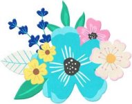
Flowers — The single most-requested embellishment across all kit themes. Offer at least 5–6 varieties: a large statement bloom, a medium flower, a small filler, and loose petals.
Leaves & greenery — Sprigs, branches, and leaf clusters to frame and soften flower placements.
Brad/button accents — Small round accents (brads, enamel dots, buttons) that act as visual full stops on clusters and layouts.
Bow or ribbon — A tied bow, ribbon strip, or folded ribbon. These add dimension and a handmade feel.
Scatter/confetti accents — Tiny dots, stars, hearts, or theme-specific shapes that fill negative space and add energy.
Twine or string — A looped, knotted, or straight piece of twine/string that grounds clusters to the page and adds texture.
Labels, Tags & Journaling
Journal card set — At least 4–6 cards in 3×4 and/or 4×6 sizes, some with lined areas. These are essential for Project Life-style scrappers and for adding journaling to any layout.
Tag — A classic gift tag or hang tag shape. One of the most versatile elements in any kit for adding small bits of text or decoration.
Sticker/label shape — A banner, badge, or label for short text and titles. Think thought-bubble shapes, pennants, or oval labels.
Date element — A small date stamp, calendar tab, or numerical accent. Scrappers always need a way to mark when a moment happened.
Overlays & Texture
Paint or ink splatter overlay — An artsy brush stroke or splatter PNG that adds handmade texture and depth to pages.
Stitching or thread overlay — A stitched border, sewn edge, or cross-stitch line that mimics the look of handmade scrapbooks.
Stamp or postmark — A distressed ink-stamp shape or postal postmark that adds vintage character and anchors text.
Word Art & Typography
Title word art — At least 1–2 large, styled phrases that are the "headline" of the kit. This is often the first thing shoppers notice in previews.
Accent word arts — 6–10 smaller phrases and single words that complement the theme and give scrappers ready-to-use text without needing to type anything.
Alpha set — A complete alphabet (A–Z, 0–9, basic punctuation) so scrappers can spell out any word they need in the kit's style.
Structural & Layout Helpers
Washi tape strip — One of the most versatile elements in modern scrapbooking. Used to anchor photos, label items, and add color in a casual, layered way.
Page border or edge trim — A decorative edge (scalloped, torn, stitched, distressed) that frames the entire layout page.
Filmstrip or photo strip — A multi-photo holder that lets scrappers display a sequence of moments in one element.
Extras That Elevate the Kit
Shadow layer (or shadowed versions) — Subtle drop-shadow versions of key elements, or a separate shadow layer file. This single addition makes layouts look polished and professional without requiring Photoshop skills.
Quick page (QP) — A fully designed, ready-to-use layout page with space for photos dropped in. This is a high-value bonus that showcases the full kit and attracts buyers who want a fast, beautiful result.
A few overarching principles worth keeping in mind: every element should come in PNG format with a transparent background, the paper files should be 3600×3600 px at 300 DPI, and offering color-variation duplicates of your most popular elements (flowers, bows, tags) dramatically increases the kit's perceived value without much extra design work.
------------------------------------------------
Here are the top 25 elements every digital scrapbooking kit should include:
Foundation Elements
Solid-color cardstock papers — A full palette of 10–15 coordinating solid papers. These are the most-used items in any kit; scrappers rely on them for backgrounds, mats, and layers.
Patterned papers — At least 8–12 designs mixing large-scale prints, small-scale prints, and geometric/textural patterns. Variety in scale is key.
Photo mat/frame — A simple, clean frame or mat for anchoring photos. Every layout has at least one photo, and a coordinating mat pulls it into the kit's palette instantly.
Cluster elements (pre-built) — A few ready-made element clusters save scrappers time and help them visualize how kit pieces work together.
Embellishments
Flowers — The single most-requested embellishment across all kit themes. Offer at least 5–6 varieties: a large statement bloom, a medium flower, a small filler, and loose petals.
Leaves & greenery — Sprigs, branches, and leaf clusters to frame and soften flower placements.
Brad/button accents — Small round accents (brads, enamel dots, buttons) that act as visual full stops on clusters and layouts.
Bow or ribbon — A tied bow, ribbon strip, or folded ribbon. These add dimension and a handmade feel.
Scatter/confetti accents — Tiny dots, stars, hearts, or theme-specific shapes that fill negative space and add energy.
Twine or string — A looped, knotted, or straight piece of twine/string that grounds clusters to the page and adds texture.
Labels, Tags & Journaling
Journal card set — At least 4–6 cards in 3×4 and/or 4×6 sizes, some with lined areas. These are essential for Project Life-style scrappers and for adding journaling to any layout.
Tag — A classic gift tag or hang tag shape. One of the most versatile elements in any kit for adding small bits of text or decoration.
Sticker/label shape — A banner, badge, or label for short text and titles. Think thought-bubble shapes, pennants, or oval labels.
Date element — A small date stamp, calendar tab, or numerical accent. Scrappers always need a way to mark when a moment happened.
Overlays & Texture
Paint or ink splatter overlay — An artsy brush stroke or splatter PNG that adds handmade texture and depth to pages.
Stitching or thread overlay — A stitched border, sewn edge, or cross-stitch line that mimics the look of handmade scrapbooks.
Stamp or postmark — A distressed ink-stamp shape or postal postmark that adds vintage character and anchors text.
Word Art & Typography
Title word art — At least 1–2 large, styled phrases that are the "headline" of the kit. This is often the first thing shoppers notice in previews.
Accent word arts — 6–10 smaller phrases and single words that complement the theme and give scrappers ready-to-use text without needing to type anything.
Alpha set — A complete alphabet (A–Z, 0–9, basic punctuation) so scrappers can spell out any word they need in the kit's style.
Structural & Layout Helpers
Washi tape strip — One of the most versatile elements in modern scrapbooking. Used to anchor photos, label items, and add color in a casual, layered way.
Page border or edge trim — A decorative edge (scalloped, torn, stitched, distressed) that frames the entire layout page.
Filmstrip or photo strip — A multi-photo holder that lets scrappers display a sequence of moments in one element.
Extras That Elevate the Kit
Shadow layer (or shadowed versions) — Subtle drop-shadow versions of key elements, or a separate shadow layer file. This single addition makes layouts look polished and professional without requiring Photoshop skills.
Quick page (QP) — A fully designed, ready-to-use layout page with space for photos dropped in. This is a high-value bonus that showcases the full kit and attracts buyers who want a fast, beautiful result.
A few overarching principles worth keeping in mind: every element should come in PNG format with a transparent background, the paper files should be 3600×3600 px at 300 DPI, and offering color-variation duplicates of your most popular elements (flowers, bows, tags) dramatically increases the kit's perceived value without much extra design work.
") The only thing I didn't agree with was loose flower petals but that could just be my taste!.
The only thing I didn't agree with was loose flower petals but that could just be my taste!.